
Work Experience
- Own end-to-end development of a GenAI-powered contract renewals decision-support platform, from executive discovery workshops and process mapping through solution design, AI prototyping, and production delivery, translating complex commercial workflows into AI-driven insights that surface non-compliance, upsell, and bundling opportunities—unlocking $3.1M in projected annual bookings.
- Own product vision, strategy, and roadmap for enterprise AI solutions in instrument services workflows, driving cross-functional execution from backlog through production adoption—resulting in $3.5M annual savings and 25× user growth following transition from a third-party solution.
- Conceived, built and deployed a full-stack 0→1 AI assistant MVP within ServiceNow for L1 support—developing back-end services, front-end UI, and integrations—to demonstrate product value and secure stakeholder buy-in, securing investment for production scale and reducing issue resolution time by 30%.
- Led end-to-end development and production rollout of a GenAI-powered image processing platform — mandating minimal human-in-the-loop review as a core product requirement, defining evaluation criteria, governance frameworks, and success metrics — achieving a 99% reduction in cost per image.
- Owned product roadmap and deployment of a GenAI-driven opportunity intelligence platform, integrating internal portfolio data with external bids, tenders, and grants—increasing qualified opportunities by 40% and driving $2M in incremental bookings.
- Led a flagship project to design and deliver analytics and visualization experiences for NGS workflows within SampleManager LIMS, collaborating closely with biologists, subject-matter experts, pre-sales, and product teams to translate complex domain needs into scalable solutions and customer-facing demos—contributing to three major enterprise wins within three months.
- Built and configured ML models and analytical dashboards using Python and SQL to identify fail-early samples, helping customers save resources and improve budgeting and planning for upcoming months.
- Built interactive BI dashboards and demo applications using Python, Plotly, C#, and SQL, supporting data-driven storytelling in pre-sales and customer engagements.
- Engineered industry-specific solutions in Platform for Science (PFS) LIMS and SampleManager LIMS platforms, reducing customer customization effort by 40%.
- Built configurable BI dashboards within SampleManager LIMS using SQL and C#, providing customers with a bird's-eye view of laboratory processes and compliance, enabling easy identification of bottlenecks and non-compliances.
Achievements
Recognition for excellence in data visualization, product design, and academic achievement—from generative AI-driven visualization innovation to award-winning app development and all-round academic performance.
Peregrine Prize — Plotly Analytics Vibe-a-thon
Recognised for creating unconventional, insight-driven visualization using generative AI prompting, demonstrating new ways to explore and reason about complex datasets.
Winner — Plotly Autumn App Challenge
Built a data application celebrated for product design excellence, intuitive user experience, and compelling data storytelling through interactive visualization.
Runner-Up — Plotly Summer App Challenge
Awarded for creative BI visualization with smooth navigation and effective exploration patterns that made complex data accessible to users.
Medal of Excellence for Best All-round Performance — M.Sc.
Honoured as an outstanding all-rounder for excellence across academics, research, public speaking, and extracurricular contributions.
Education
Leadership Positions
Leadership roles focused on building inclusive communities, amplifying underrepresented voices in technology, and driving collaborative initiatives across organisations and institutions.
Women in IT Lead — Thermo Fisher Scientific
- Led site-wide initiatives to amplify women in tech by enabling opportunities to lead technical sessions, build confidence, expand networks, and create visibility.
- Drove AI-native operations within the Women in IT committee, with all communications and artefacts created and reviewed using AI-assisted workflows.
- Moderated the Women in IT book club, curating women-centric reads to foster awareness of lived experiences and encourage inclusive allyship.
Science Secretary — Mount Carmel College
- Organized and executed inter-collegiate science events and challenges, collaborating across departments and student committees.
- Ideated and led activities for the annual science fest, shaping themes, formats, and engagement strategies.
Speaking & Moderation
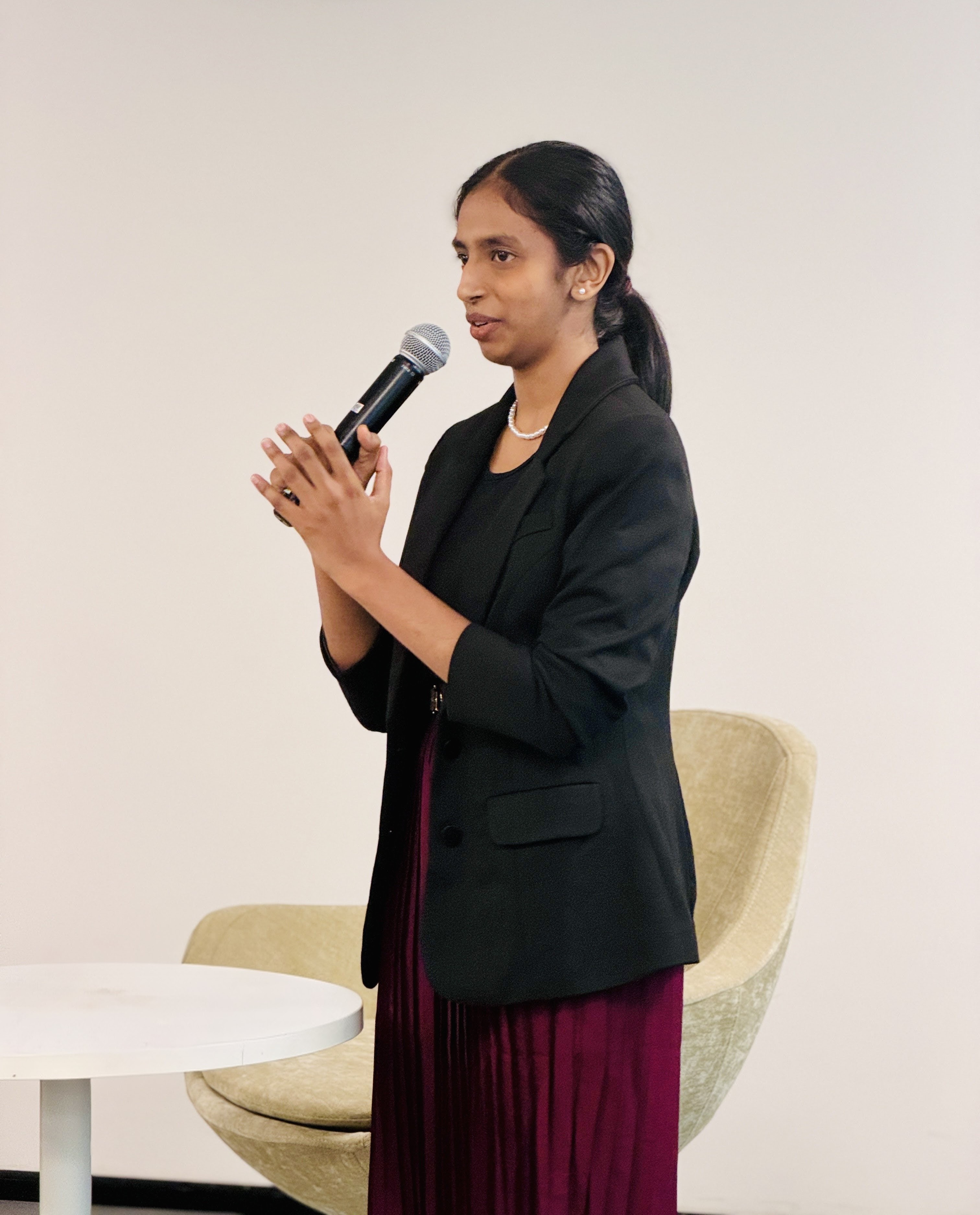
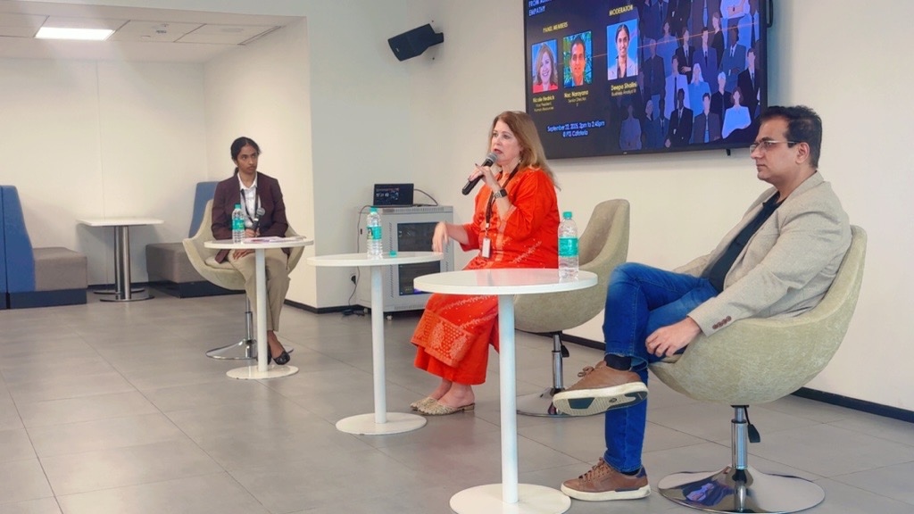
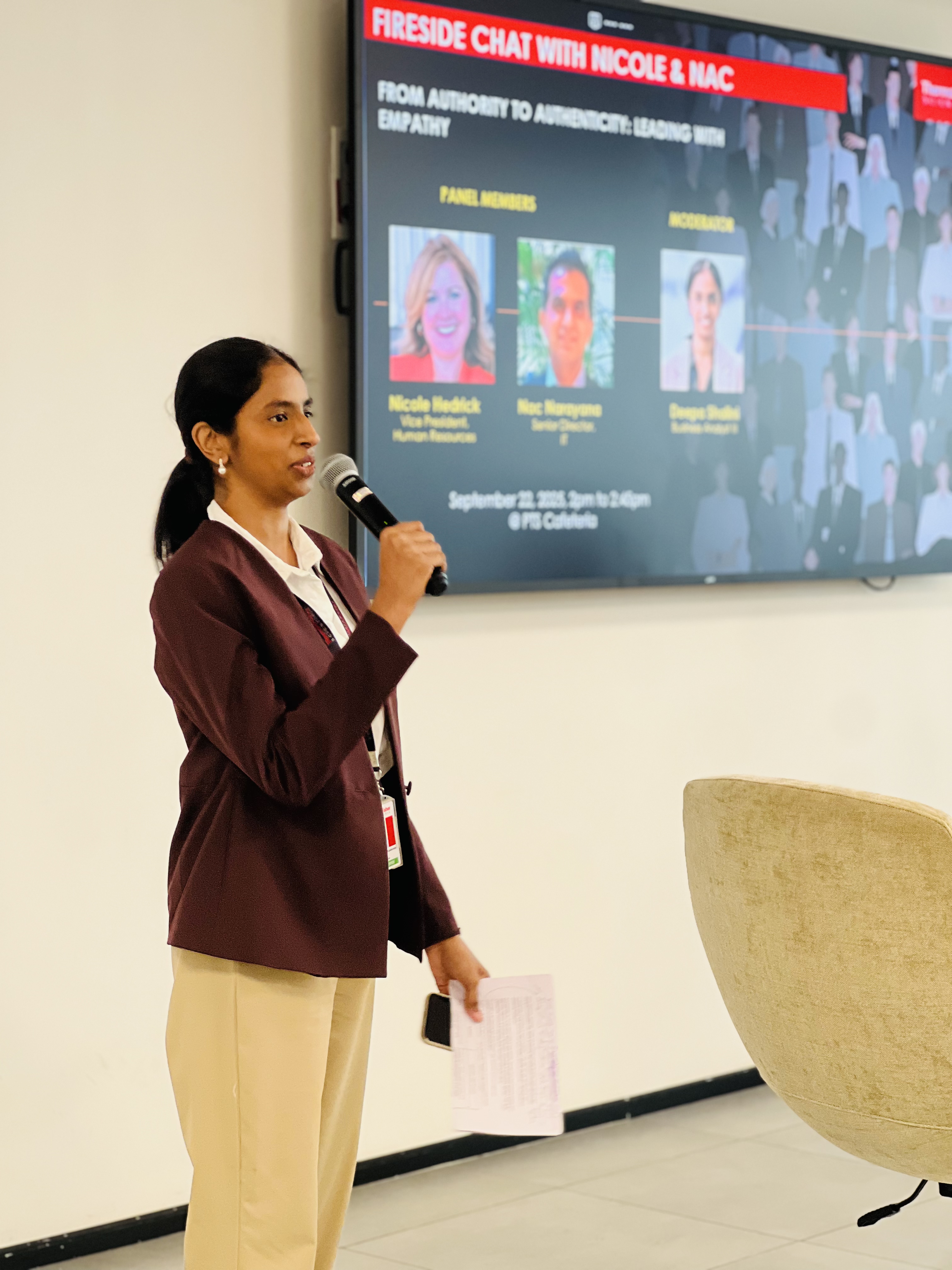
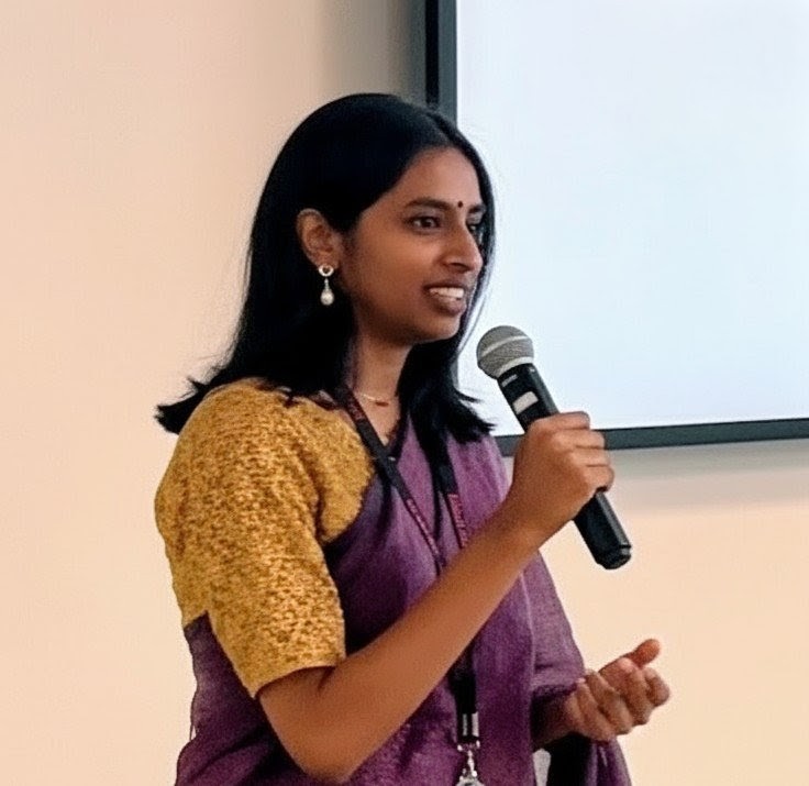
A confident public speaker and moderator, known for clear thinking, strong stage presence, and engaging senior leaders and large audiences with executive-ready communication.
Writing & Publications
I explore how we extract meaningful insights from data, how AI can accelerate that process, and how the right interfaces help teams visualize ideas early, reason better, and make decisions faster.
 Publication
The Golden Trilogy with Plotly
Published on Plotly • Apr 2026
Explores how the same dataset can evolve from standard financial charts to expressive, narrative-driven visualizations.
Read article →


Product Idea: ChaRtBot
ChaRtBot is a visual analytics assistant that enables researchers and data-driven individuals to explore, analyse, and model datasets using natural language — producing interactive, inspectable visualization with full visibility into both data and AI-generated code.
No signup required. Upload a CSV and explore your data
through interactive, explainable visualization — in seconds.
👉 Try ChaRtBot live.
Product Vision and Strategy
Product Vision
ChaRtBot is a visual analytics assistant designed to support the full analytical lifecycle — from exploratory data analysis to modelling and research communication — through natural-language interaction and transparent, interactive visualization.
The vision is to make data exploration and analysis visual-first, reliable, and explainable, enabling individuals to move from raw datasets to defensible insights while keeping humans firmly in the loop through dataset inspection, explicit transformations, generated code visibility, and reproducible outputs.
Unlike text-centric AI tools that respond with explanations, ChaRtBot responds with interactive visual reasoning. Unlike traditional analytics platforms that prioritise dashboards and configuration, ChaRtBot is lightweight, web-based, and requires no setup — lowering the barrier to rigorous analysis without sacrificing credibility.
As ChaRtBot matures, it extends beyond exploration to support publication-grade outputs, including static visualization suitable for academic and professional dissemination, ensuring insights can move seamlessly from analysis to communication.
Product Strategy
ChaRtBot is intentionally designed around four core principles:
1. Visual reasoning first
visualization are not an output format — they are the primary medium for reasoning.
ChaRtBot prioritises interactive, exploratory visuals that allow users to:
- Inspect distributions, relationships, and outliers
- Iterate quickly on hypotheses
- Build intuition before formal modelling
Text and explanations exist to support visuals, not replace them.
2. Progressive depth
ChaRtBot evolves with the user’s analytical needs.
- Early interactions prioritise fast, interactive exploration
- Generated code and analytical steps are explained in plain language alongside visual outputs
- Advanced workflows support full-scale exploratory data analysis and machine learning
- Mature workflows enable publication-ready static outputs suitable for academic and professional dissemination
This progression allows non-technical users to start quickly while enabling deeper, research-grade analysis over time — without forcing complexity upfront.
3. Transparency as a non-negotiable constraint
All analysis performed by ChaRtBot is inspectable and reproducible.
Users can:
- Examine raw and transformed data
- Review AI-generated Python code
- Understand assumptions, aggregations, and modelling choices through both code and natural-language explanations
- Export both interactive and static outputs with confidence
Transparency is treated as a prerequisite for trust, scientific validity, and human oversight at every stage of the workflow.
4. Individual- and research-first adoption
ChaRtBot is built for individual researchers, students, and data-driven professionals working on exploratory analysis, learning, and research projects.
It intentionally avoids the overhead of enterprise BI tools — such as rigid schemas, dashboards, and licensing complexity — while still supporting workflows that demand analytical rigor and publishable outputs.
Roadmap
Product Roadmap
ChaRtBot is developed in phases, each progressively increasing analytical depth, reliability, and usability while maintaining transparency and user control.
Phase 0: Current MVP
Goal: Deliver instant, shareable visual insights from user-provided data
Capabilities
- CSV upload with interactive data table (sort, filter, scan)
- Natural-language prompts for interactive chart generation
- Support for complex subplotting and multi-chart layouts
- Visibility into the generated Python code
- Interactive HTML export
- Static image export
- Web-based, link-only access (no installation required)
- Chart rendering within seconds
User Value
- Faster visual exploration compared to text-based AI tools and desktop software
- Shareable interactive outputs for analysis and communication
- Transparency through dataset inspection and code visibility
Phase 1: Explainability & Reliability
Goal: Expand accessibility to non-technical users while increasing trust and robustness
Capabilities
- Plain-language explanations of generated code
- Visual explanations of data transformations
- Explicit communication of system assumptions
- Pre-execution validation (schema, columns, types)
- Multi-pass code correction to recover from errors
- Fallback chart strategies when complex visualization fail
- User confidence checks and satisfaction feedback
Why this matters
- Fewer failed or misleading outputs
- Clear understanding of how results are produced, even to non-Python users
- Increased confidence in correctness and reliability
Phase 2: Conversational Refinement & Intent Clarification
Goal: Resolve ambiguity before it leads to incorrect analysis
Capabilities
- Detection of ambiguous or incomplete prompts
- Targeted follow-up questions to clarify intent
- Explicit declaration of assumptions when clarification is skipped
- Chart and analysis structure suggestions
- Guided disambiguation for multi-structure datasets (e.g. multi-sheet files), including schema and subset selection
User Value
- Fewer incorrect or misaligned charts
- More collaborative, analyst-like interaction
- Reduced trial-and-error prompting
Phase 3: Advanced EDA & Statistical Analysis
Goal: Enable deeper reasoning beyond individual charts
Capabilities
- Automated and guided exploratory data analysis
- Distribution, correlation, and outlier detection
- Statistical analysis with visual explanations
- Dataset-aware chart recommendations
- Advanced techniques such as PCA, clustering, and dimensionality reduction
User Value
- Faster discovery of patterns and anomalies
- Scalable exploration of complex datasets
- Shift from charting to analytical reasoning
Phase 4: Machine Learning–Augmented Analysis
Goal: Support predictive and inferential analysis grounded in exploratory understanding
Capabilities
- Scalable exploratory data analysis for large datasets
- Guided transition from EDA to modelling
- Task-aware model selection
- Model training for prediction and classification
- Accuracy evaluation using visual diagnostics (e.g. error distributions, confusion matrices)
- Clear reporting of accuracy, model performance, limitations, and assumptions
User Value
- Predictive insights without manual ML setup
- Explainable and defensible modelling outcomes
- Clear understanding of model behaviour and reliability
Phase 5: Real-Time & External Data Integration
Goal: Reduce dependency on manual dataset uploads
Capabilities
- Integration with public and real-time data sources
- Source citation and provenance visibility
- Dataset enrichment and combination
- Data freshness checks
User Value
- Faster insights without manual data collection
- Support for time-sensitive and contextual analyses
- Broader analytical possibilities beyond static files
Phase 6: Publication-Grade Outputs & Sharing
Goal: Enable high-quality communication of insights
Capabilities
- Publication-ready chart styling and themes
- High-resolution static exports for papers, posters, and presentations
- Versioned chart history
- Shareable links with embedded interactivity
Strategic Impact
- Seamless transition from data → analysis → communication
- Outputs suitable for reports, presentations, and publication
- Reduced friction in the final mile of analysis
KPIs and Success Metrics
ChaRtBot's success is measured across adoption, insight velocity, reliability, and trust, with additional metrics tracking whether users progress toward deeper analytical workflows over time.
1. Adoption & Core Engagement
Why: To validate that ChaRtBot delivers immediate, repeatable value as part of users' data exploration workflow.
Metrics
- Weekly Active Users (WAU)
- Datasets analysed per active user
- Average charts generated per dataset
- Percentage of sessions with conversational follow-up prompts (Phase 2+)
- Usage rate of multi-chart and subplot layouts
2. Insight Velocity & Exploration Quality
Why: ChaRtBot's primary value is helping users reach meaningful insights quickly through visual reasoning.
Metrics
- Median time to first chart
- Median time to first follow-up analysis
- Average number of chart iterations per dataset
- Percentage of sessions progressing beyond a single chart
NOTE: Fewer iterations with deeper follow-ups is a positive signal, not a failure.
3. Performance & Reliability
Why: Analytical trust breaks quickly when outputs fail, stall, or behave inconsistently.
Metrics
- Chart render success rate
- Median chart render time
- Error recovery success rate (Phase 1+)
- Drop-off rate during chart generation or correction flows
4. Trust, Transparency & Explainability
Why: ChaRtBot is explicitly human-in-the-loop; trust is demonstrated through inspection, validation, and reuse.
Metrics
- Percentage of sessions where users inspect generated code
- Percentage of sessions where users view natural-language explanations of analytical steps (Phase 1+)
- Percentage of exports reused without modification
- User-reported confidence in correctness after analysis (Phase 1+)
NOTE: Reuse without modification is a strong trust signal.
5. Analytical Depth & Workflow Progression
Why: To measure whether users move from basic visual exploration toward deeper analytical reasoning over time.
Metrics
- Percentage of sessions using guided EDA features (Phase 3+)
- Percentage of datasets progressing from EDA to modelling (Phase 4+)
- Frequency of model evaluation or iteration based on diagnostics (Phase 4+)
- User-reported clarity around assumptions and limitations (Phase 3+)
6. Retention & Longitudinal Value
Why: Long-term success depends on whether ChaRtBot grows with users rather than being a one-off utility.
Metrics
- Retention rate by analytical depth (basic vs advanced users)
- Increase in average workflow depth per returning user
- Repeat analysis on the same dataset over time
- Percentage of users adopting new phases as they are released